"I think there are two keys to being creatively productive. One is not being daunted
by one's fear of failure. the second is sheer perseverance."
~~Mary-Claire King
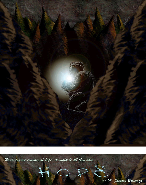
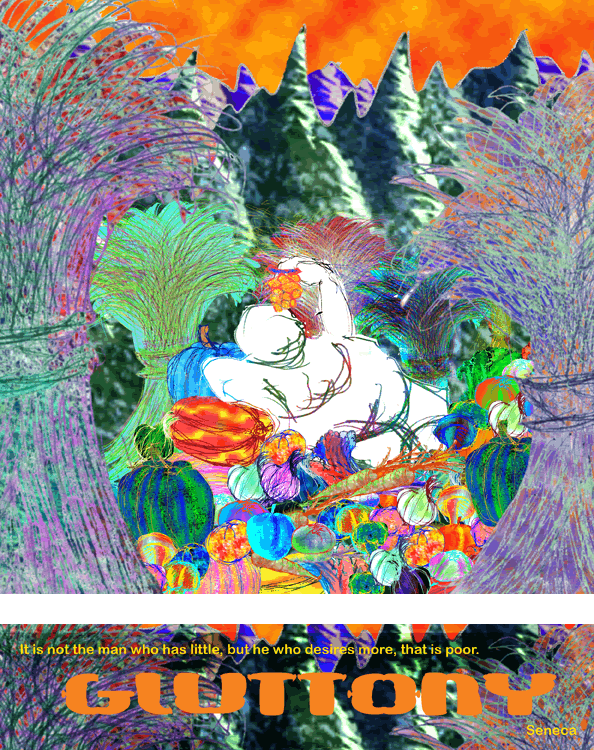
Hope and Gluttony
This series is called Hope and Gluttony. We were given a list of the seven deadly
sins and Heavenly virtues and required to choose one of each and illustrate iton the computer. We had to take color into consideration. Most people used bright colors on the virtue and dark colors on the sin. I chose to reverse them. The bright colors of the sin give a cheery feeling but what is occurring in the scene is not a good thing, giving the viewer an uneasy feeling because things are not as they seem. In the virtue, the colors are dark and drab, as if his greed from before has drained all color and light from the land. But in the darkness, there is one tiny ray of hope shining through. This is what it feels like to hit rock bottom. Things seem dark and grim, but one tiny bit of hope can light the way. As long as it exists, you can hang on.
This digital illustration series was created as part of a class project.
Click on the thumbnails to see larger versions.
Clicking a thumbnail will open a new window.