"Nothing encourages creativity like the chance to fall flat on one's face."
~~James D. Finley
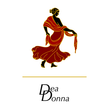
Dea Donna
![]()
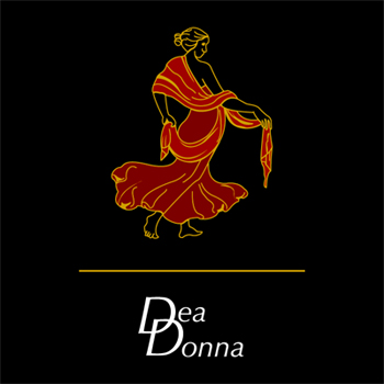
The Dea Donna logo was created to exist as a whole or so that each piece, the
figurine, the Dea Donna logotype or simply the double D initials could stand alone.
By doing this we had a more flexible piece that was better suited to a multitude of
situations. Depending on the formality of the situation, be it a print ad, store
merchandise or even something as simple as tissue paper, we could mix and
match the pieces and still have a recognizable brand.
Creation
![]()
![]()
![]()
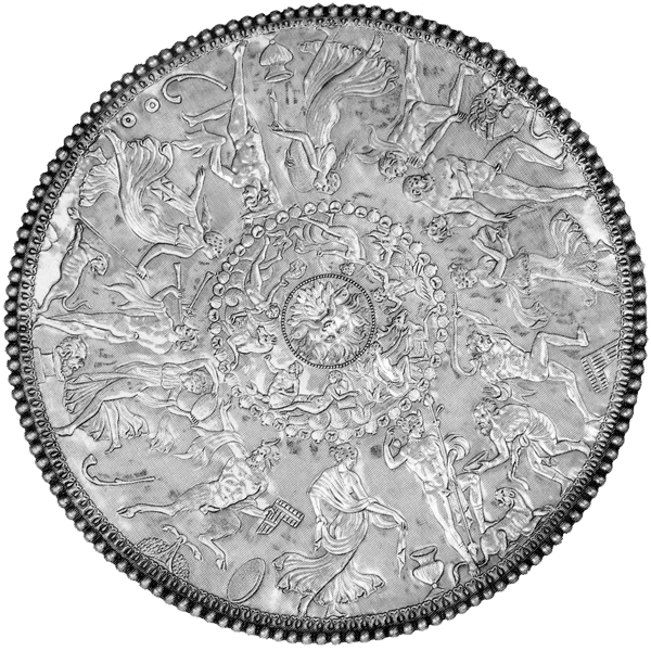
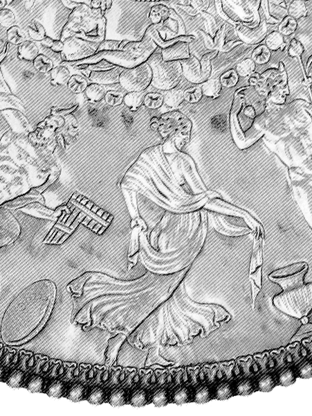
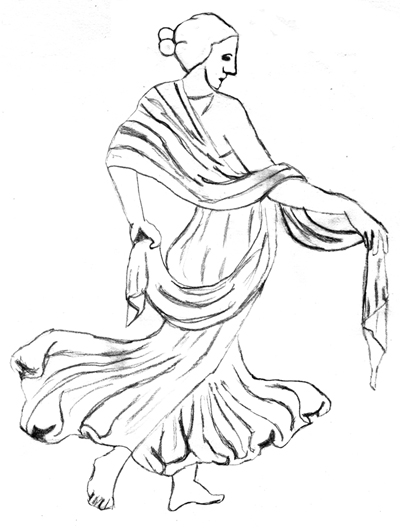
During the intial design phase of the logo my team responded well to the Dea
Donna logotype and the double D initials but felt that it needed a more intricate
element. The figurine was taken from a Roman shield covered in dancing figures.
I scanned, traced, colored and illustrated several from the shield. The final choice,
they decided,had the grace and flow that they wanted to represent Dea Donna,
which in Italian means Beautiful Woman.
Click on the pictures to see larger versions.
Clicking a picture will open a new window.